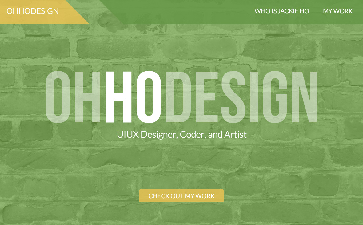
Brief: After 1.5 years with my old site, I decided I needed to refocus my site on my web and UIUX work. My previous site (shown below), while striking with a variety of images and color, lacked a voice and a personal touch.
Execution: I decided early on I wanted a site that would be straight-forward and to the point about who I am, what I do, and what I care about. Morever, instead of loading all my work on a single page by category, I wanted to focus on my UIUX work and hone in instead on large projects. This structural change would not only improve page load time (something I struggled with in the previous site) but also give me a platform to candidly share my thought processes.
Tools: Adobe Illustrator, Photoshop, Github, HTML/CSS


The design of my site evolved alongside the development. As for the main color, I decided to run an ad hoc user test of sorts by posting two versions of the title screen (one in green, the other in orange) on my personal Facebook account and asked for people's opinions. I received a flood of responses, with and without explanations, which ultimately led me to decide on the color scheme I have now.
Previous Design:


