![]() WEB AND UIUX
WEB AND UIUX
![]()
![]() WEB AND UIUX
WEB AND UIUX
![]()
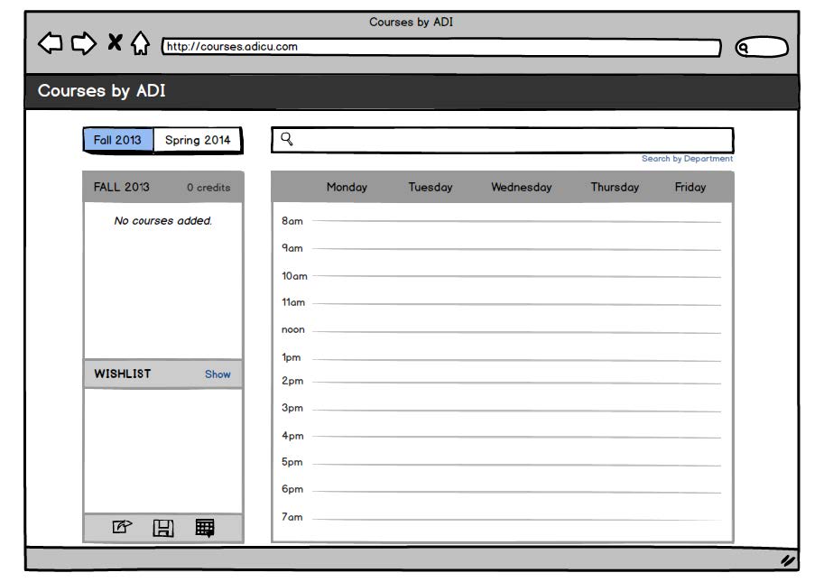
Brief: A tool widely used by Columbia students, the Application Development Initiative (ADI) 'Courses' was a schedule building web app that allowed users to browse classes and visualize them on a calendar. While core functionality of the application had already been built, we decided to update Courses by adding additional features, as well as solve some key usability issues that severly hindered the user experience. This project was part of the Design and Agile Project Management in Entrepreneurship class at Columbia, led by Professor Farrohknia.
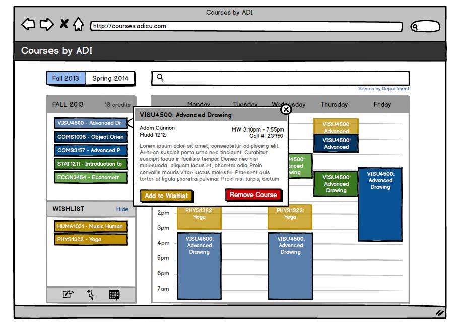
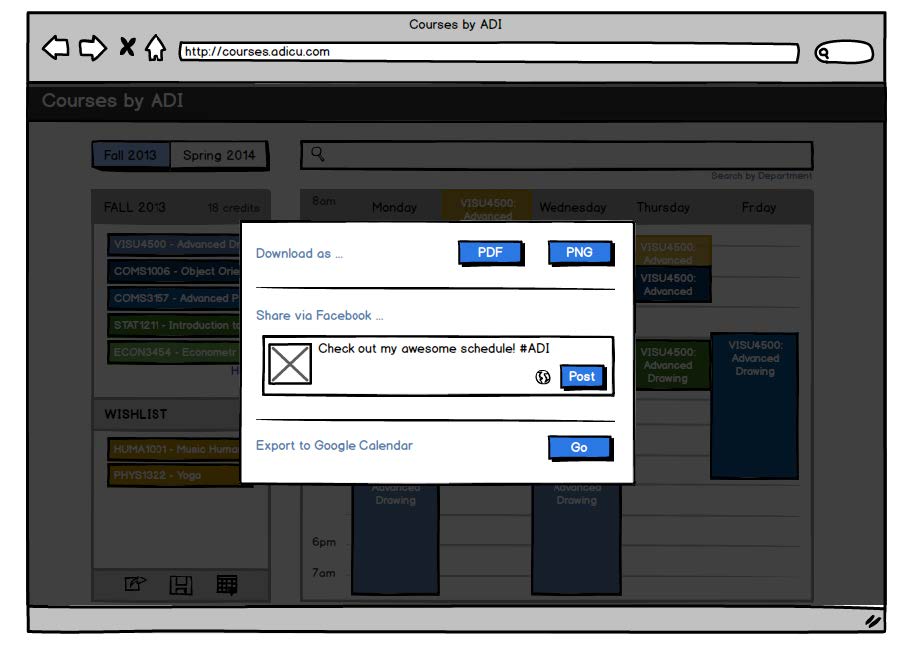
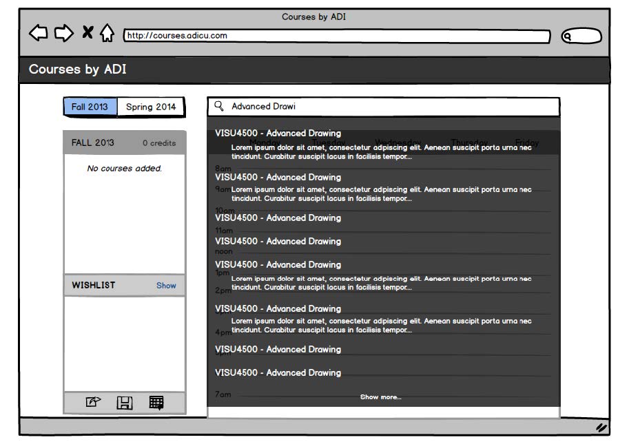
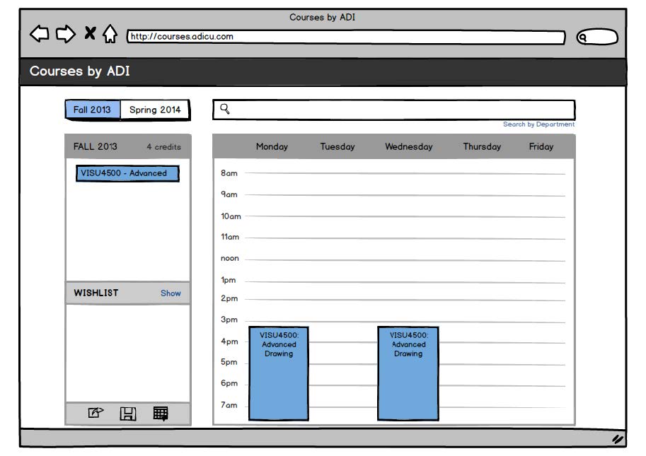
Execution: After observing and interviewing new and existing users of the app, I created mockups using Balsamiq to illustrate key feature and UI changes. I wanted to explore how Courses could go beyond a simple schedule builder and become a means of class exploration and discovery. Moreover, I also wanted to focus on what a user could do after finishing his/her schedule.
As part of the class, we each presented our user research findings and detailed our design changes via illustrations and wireframes. My presentation consisted of the wireframes shown below. The final product was developed by another group after taking ideas and feedback from the class discussion.
ADI Courses has since retired as of 2015, replaced by Vergil, created in partnership between ADI and the University.
Tool: Balsamiq
Initial sketches.
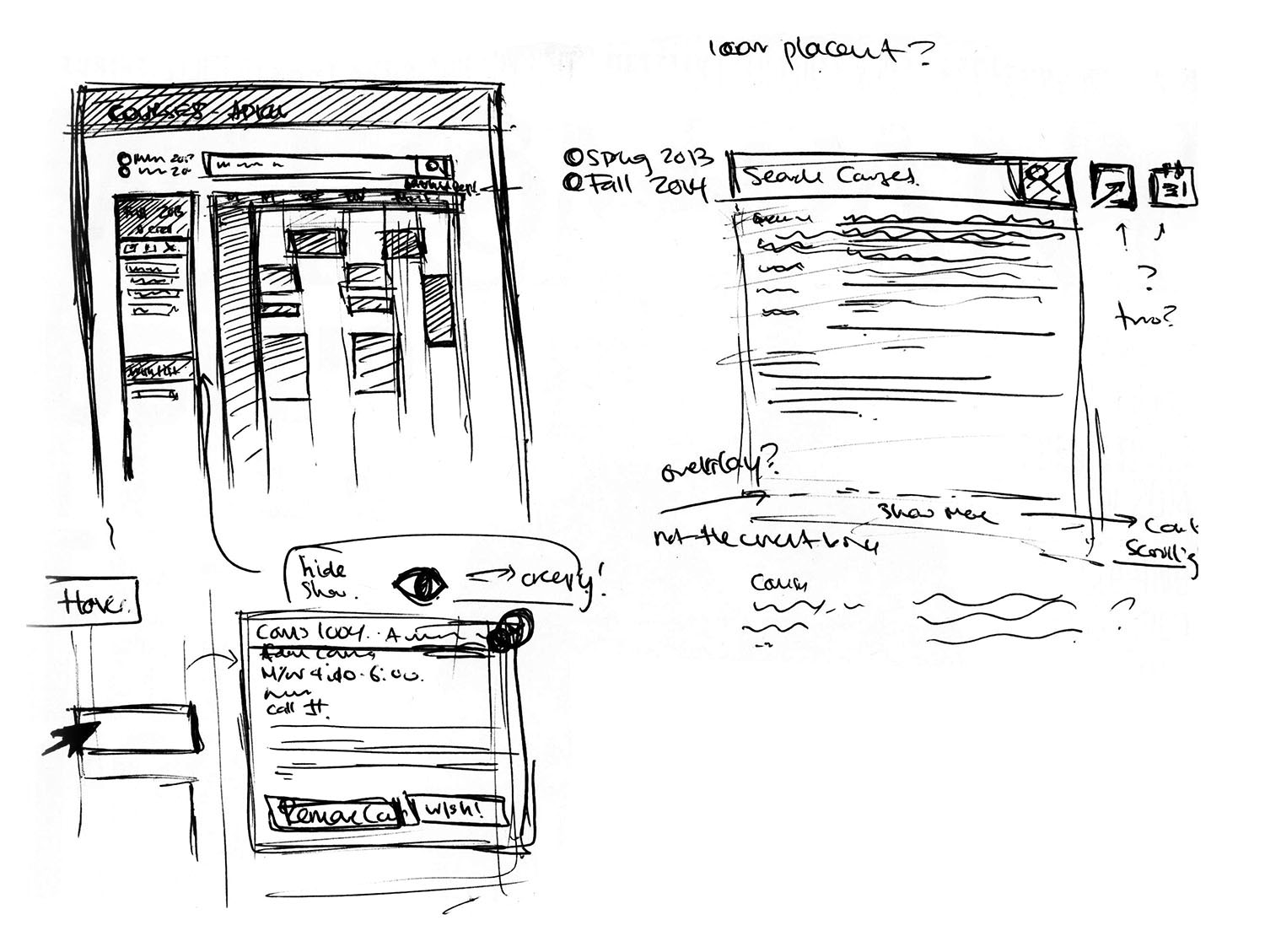
(Left) First screen. Increased prominence of the semester switch. (Right) Overlay dropdown instead of solid.
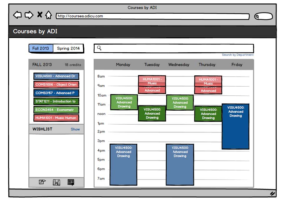
(Left) Single class added. (Right) Different colors for classes.
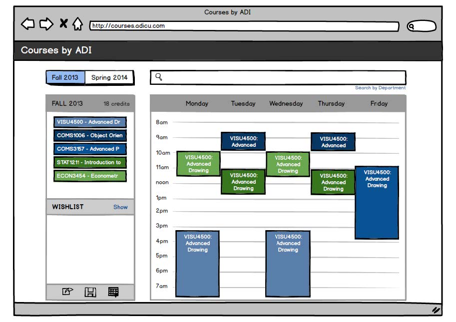
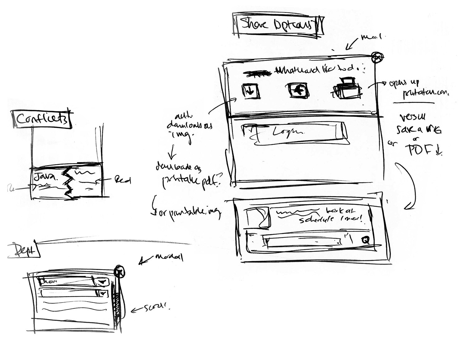
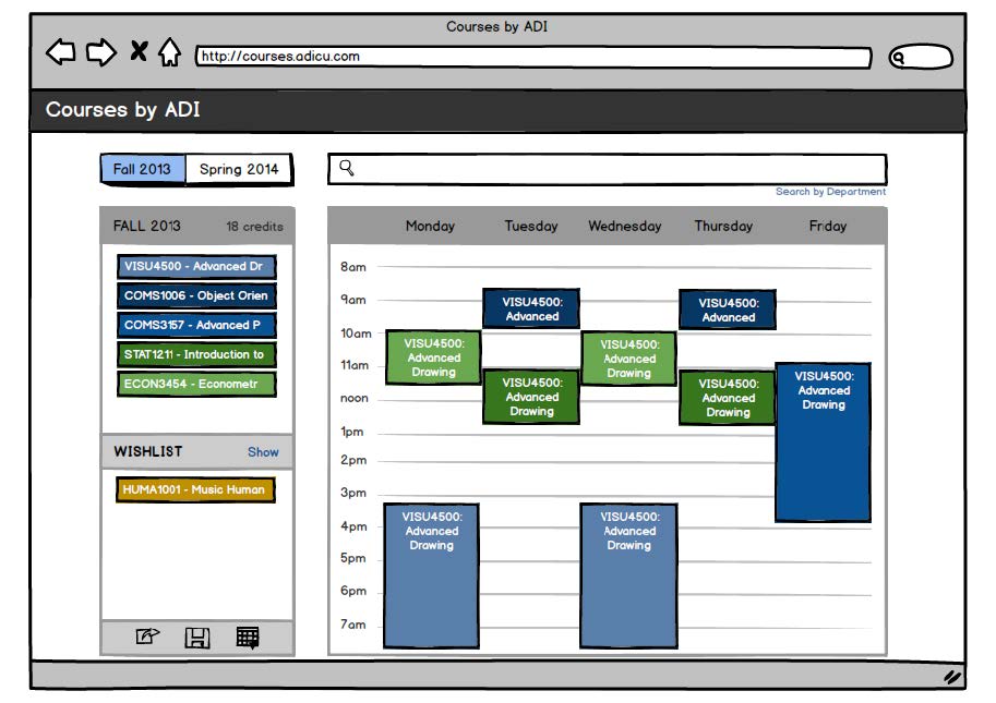
(Left) Conflicts overlapped in red. Note: In hindsight, not a good solution. (Right) Wishlist feature. User can hide or show wishlist classes.
(Left) Individual class description. (Right) "Next step" window, including sharing and exporting to Google Calendar.